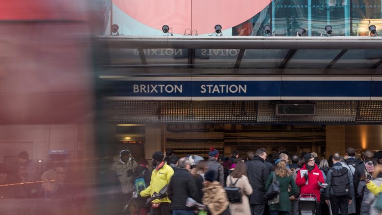
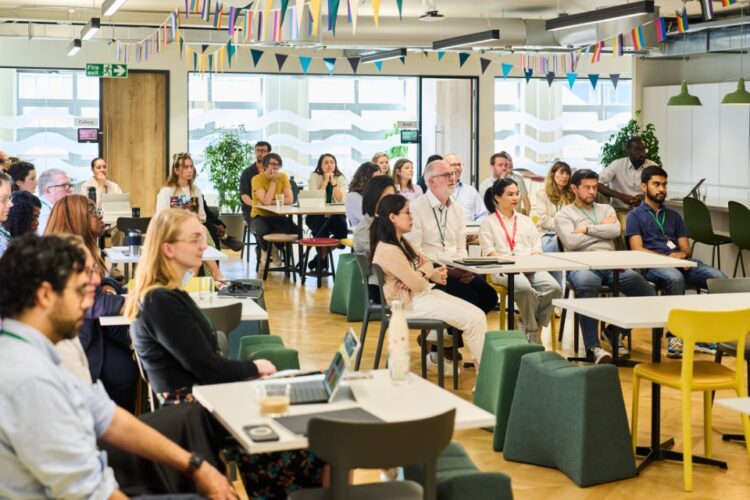
About us
Through our family of forward-looking organisations, we collaborate with others and use our assets as an independent foundation to transform lives.
Read more
These guidelines are here to help you use the Guy’s & St Thomas’ Foundation brand.
Some of the key elements have been pulled out on this page. However, full guidance is in the brand guidelines document.
All use of our brand is subject to sign-off from the Foundation. Therefore, if you are a partner looking to create materials which feature our brand, please liaise with your contact at the organisation to get these materials approved.
Finally, if you have any questions on how to use these guidelines, please contact our communications team on communications@gsttfoundation.org.uk.
This boilerplate text can be used to talk about the Foundation in more detail:
At Guy’s & St Thomas’ Foundation, our mission is clear – to build the foundations of a healthier society.
For over 500 years we’ve been a constant in London’s ever-changing landscape, at the leading edge of health. Our commitment and determination is backed by our endowment which allows us to take a long-term view, whilst tackling the real and urgent health challenges of today.
Working in collaboration with our communities, partners and hospitals and using our assets to transform lives. To invest in people and in imagination, in purpose and in impact.
From our part of the city to cities around the world. A diversity of ideas coming together to drive positive change through everything we do – because a healthier society is our collective endeavour.
Our primary colour palette should be the main colours you use in any materials representing the brand. Furthermore, to add warmth and to complement our primary colours, we have a secondary colour palette. Finally, to add highlight or attention, we have a tertiary colour to be used more sparingly.
■ Dark green: #395234, RGB 57 82 52
■ Mid green: #396847, RGB 57 104 71
□ Cream: #F2E4D0, RGB 242 228 208
■ Salmon: #EA8774, RGB 234 135 116
■ Gold: #F5B42D, RGB 245 180 45
■ Zingy red: #FF4B50, RGB 255 80 75